Having spent most of my career playing around with the written word, it recently struck me that it could do me a bit of good to fall back in love with the printed one.
That’s what I originally set out to study as a fledgling designer before writing copy and occasionally coming up with a nice creative concept took over as my main thing. Back in the days when the Mac wiped out a whole set of skills virtually overnight.
Marching orders for the soldiers of lead?
One day at college we went home with cow-gum gooey fingers (and brains), only to return the next to a small, white plastic box with a postcard-sized screen that read, writ large in Apple’s precocious new font, Chicago (remember that?): “Hey, dickhead. Everything you just spent the last year learning. Forget it.”
Or so it seemed.
In fact, when designing and setting type leapt from the layout pad and workshop to the screen, a whole system of processes, both manual and cerebral, were unceremoniously jettisoned. Along with the Grant enlargers, Letraset catalogues, tracing paper, cow gum, putty rubbers and all that sticky paste-up paraphernalia.
This analogue to digital transition was taken up with great gusto by typographers, designers and artworkers. And why the Helvetica not? You could now do things in an hour that would have previously have taken days. The capabilities were mind-blowing. Type could be resized on screen. Colours changed. Leading and kerning precisely nudged and shuffled before your very eyes. Yes, that sounds lame today, but back then it was no less than actual real magic. The possibilities seemed endless. And so it was that the old ways of printing were consigned to a wire trash can in the corner of a computer screen.
A new army rises
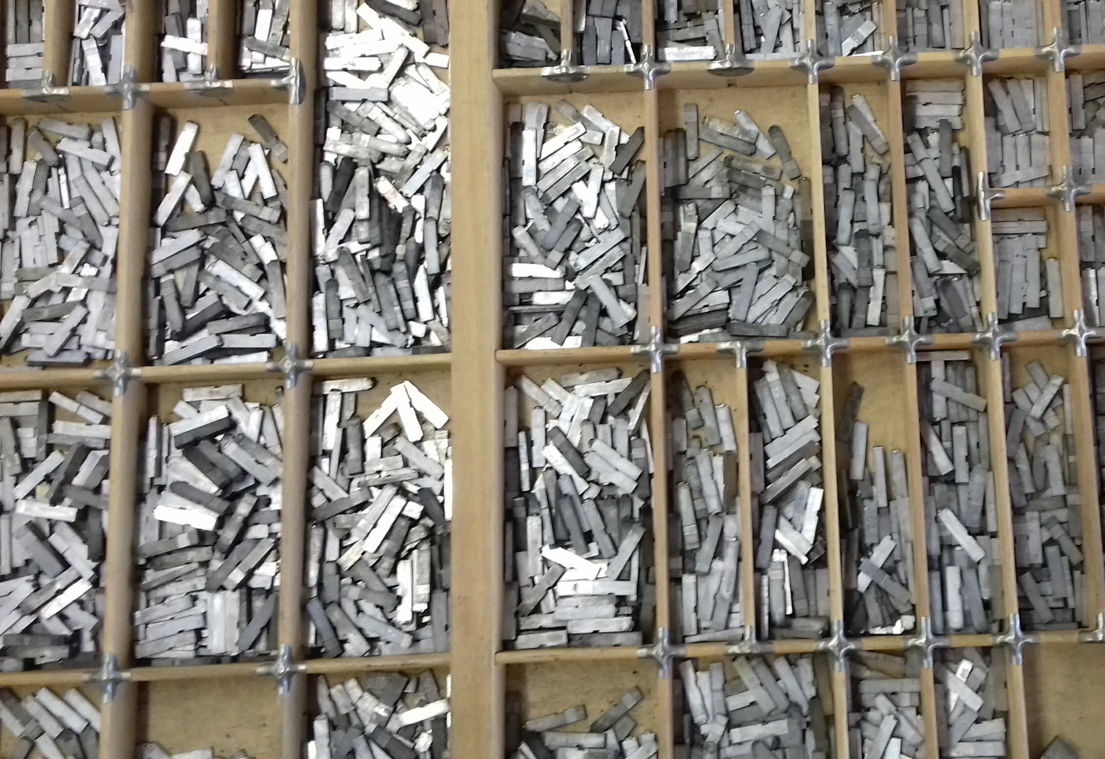
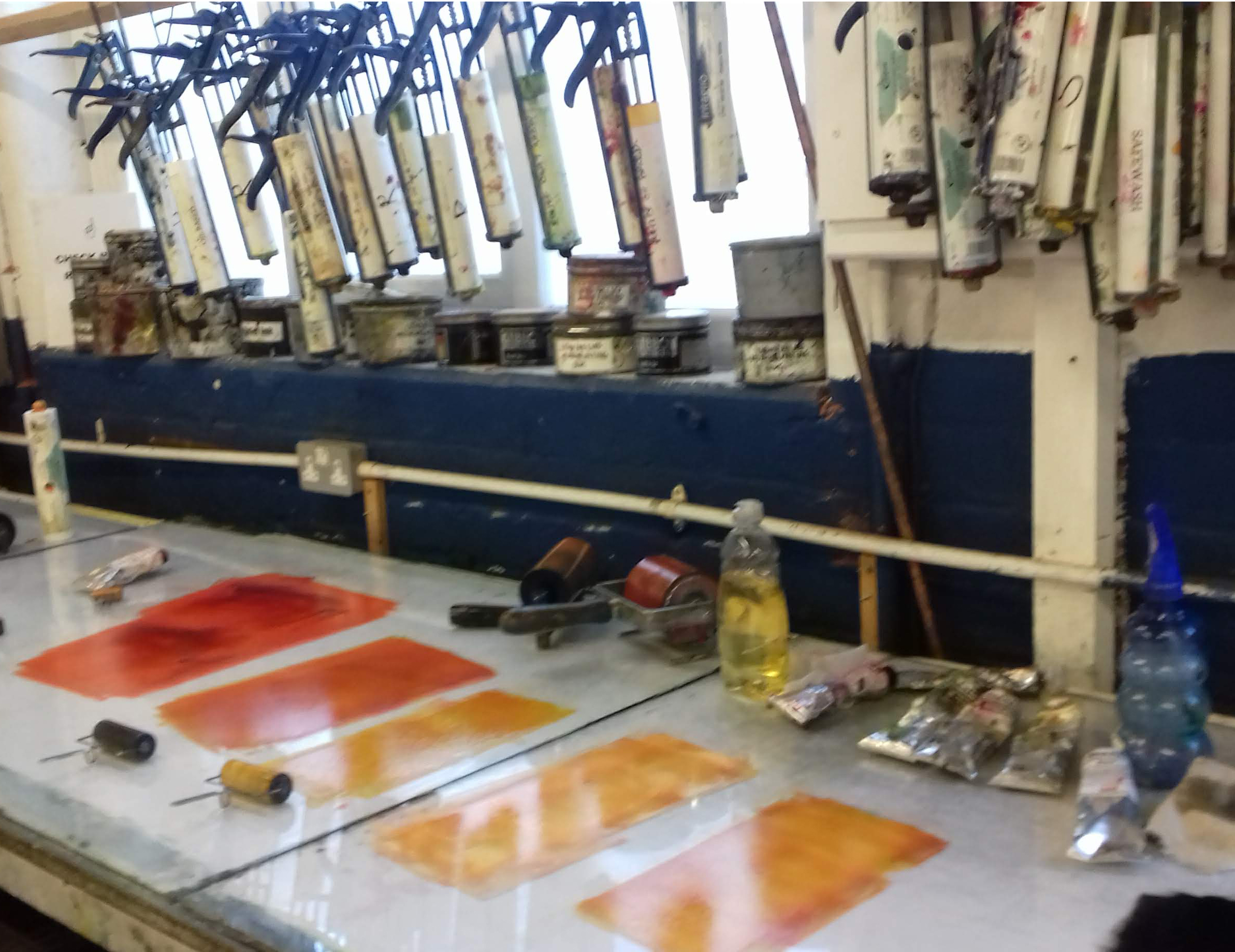
But, like all the best persecuted practises, the art of letterpress didn’t die, it went underground to be kept alive in backstreet workshops, cellars and anonymous industrial units around the globe. Dedicated groups of people gathered the presses, typefaces, inks, quoins, chases and all the other ephemera required to create a letterpress print and saved them from the scrapheap. They’ve been tracked down, collected, refurbed and restored so that today, they’re still hard at work in studios producing everything from oh-so classy wedding invites to thousand-dollar fine art prints.
Places like Hotbed Press, sunny Salford’s centre of printmaking excellence where letterpress is taught and practised alongside other cool stuff like screenprinting and lithography and etching.
I’ve just closed the cover on the Complete Letterpress Printer course at this printmaking facility. I joined partly to scratch a persistent creative itch and also to reconnect with the things that drew me to graphic design and typography way back when.
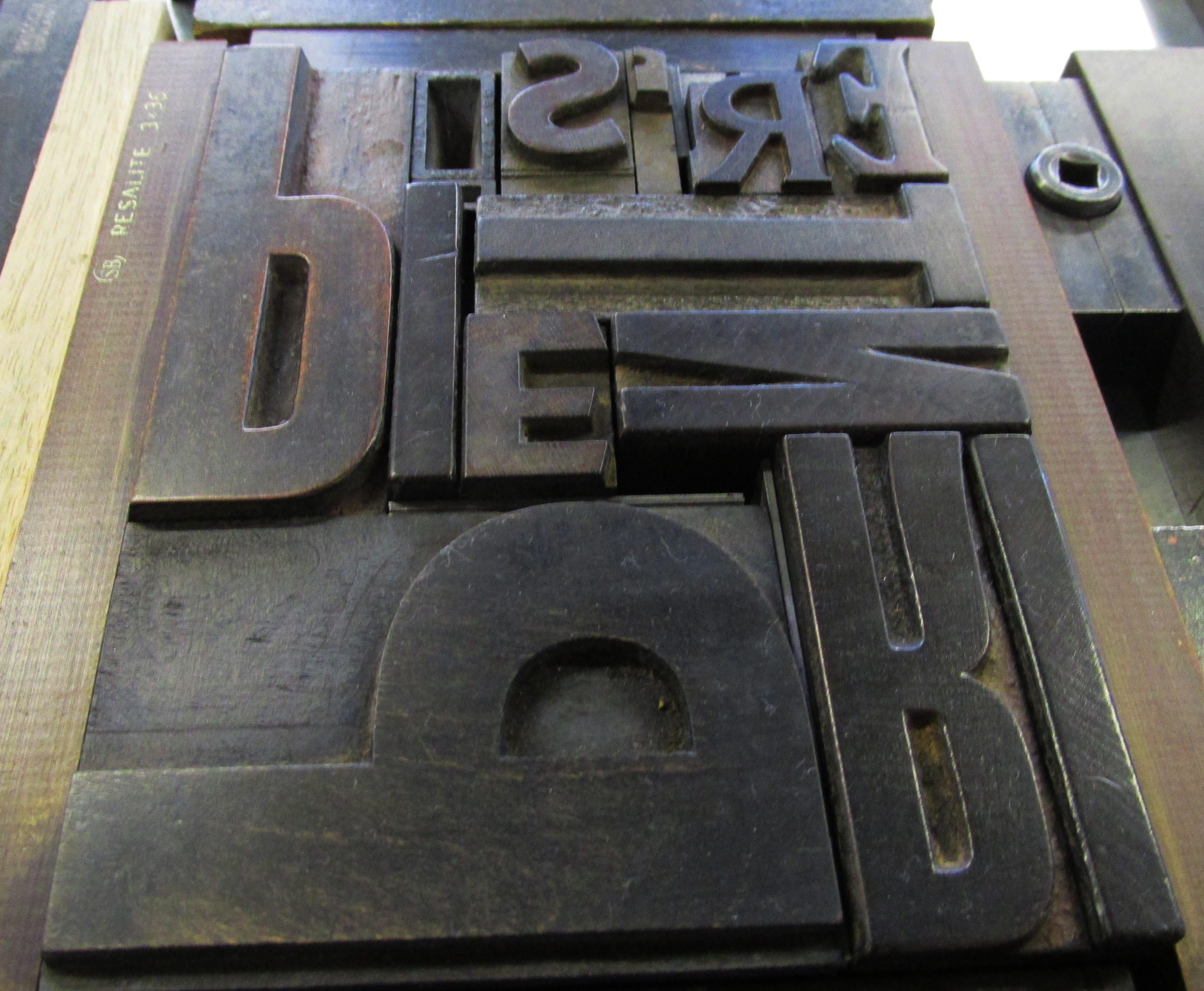
The tactility of type. The texture of a fine paper. The concentration and spatial awareness, not to mention puzzle solving and maths skills, required to set type that looks the way you want. The repetitive rhythm of a 100-year old press set in motion. And the near-meditative state that can be achieved by a combination of all these, plus an atmosphere thick with the heady aroma of white spirit and printing ink.
All objectives achieved.
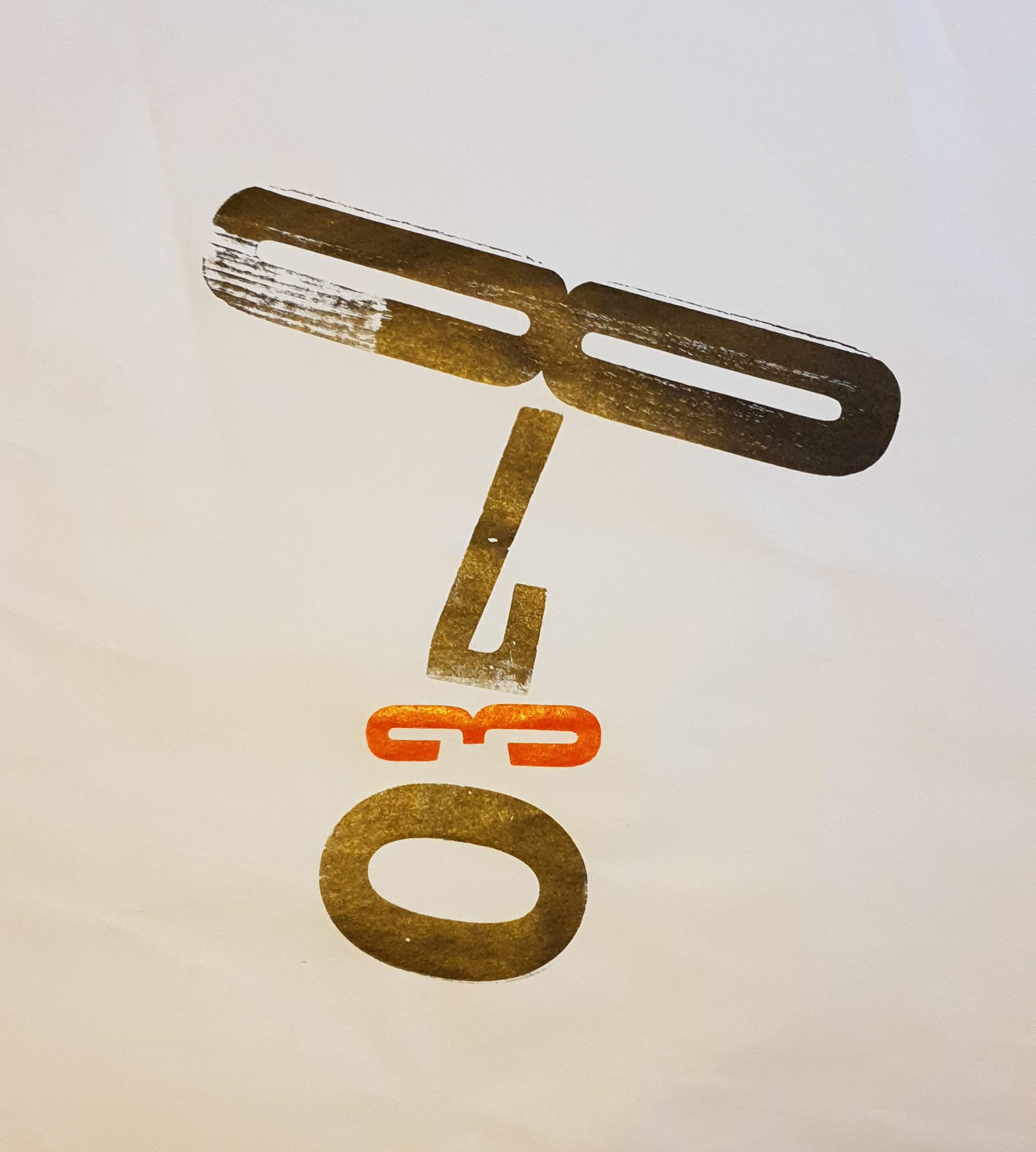
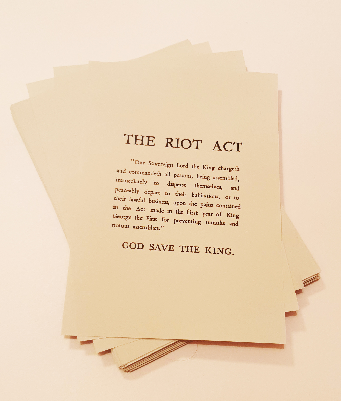
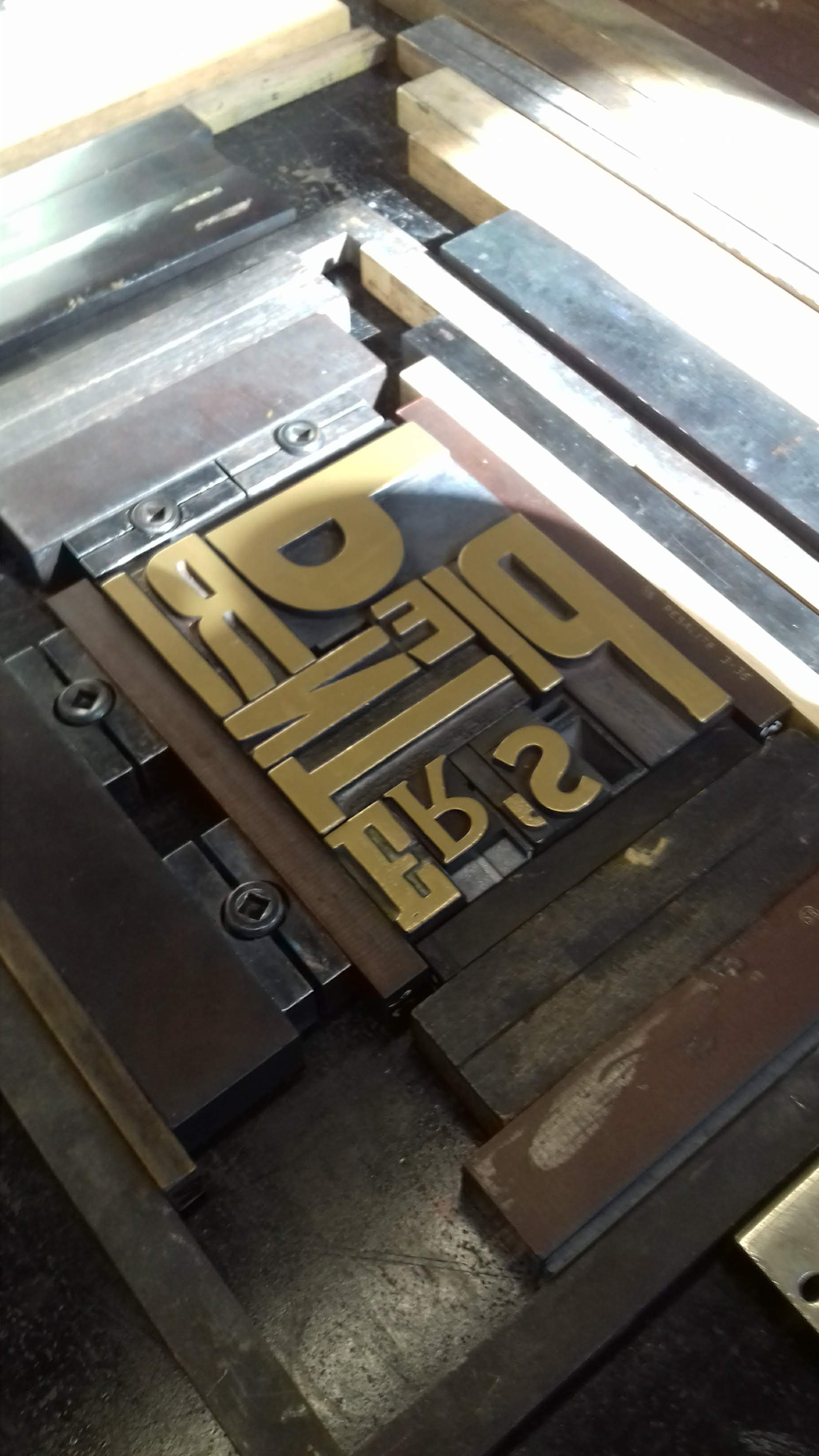
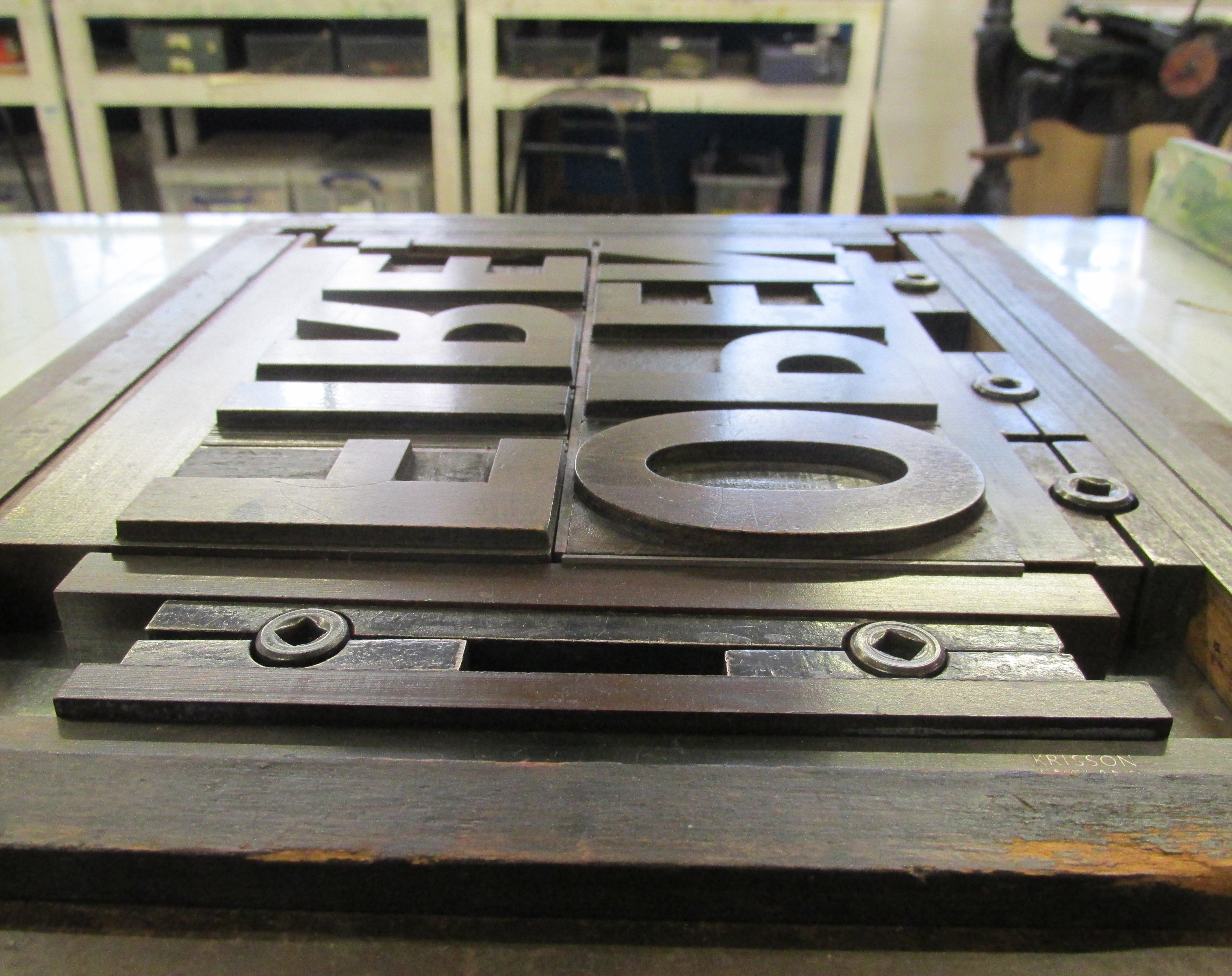
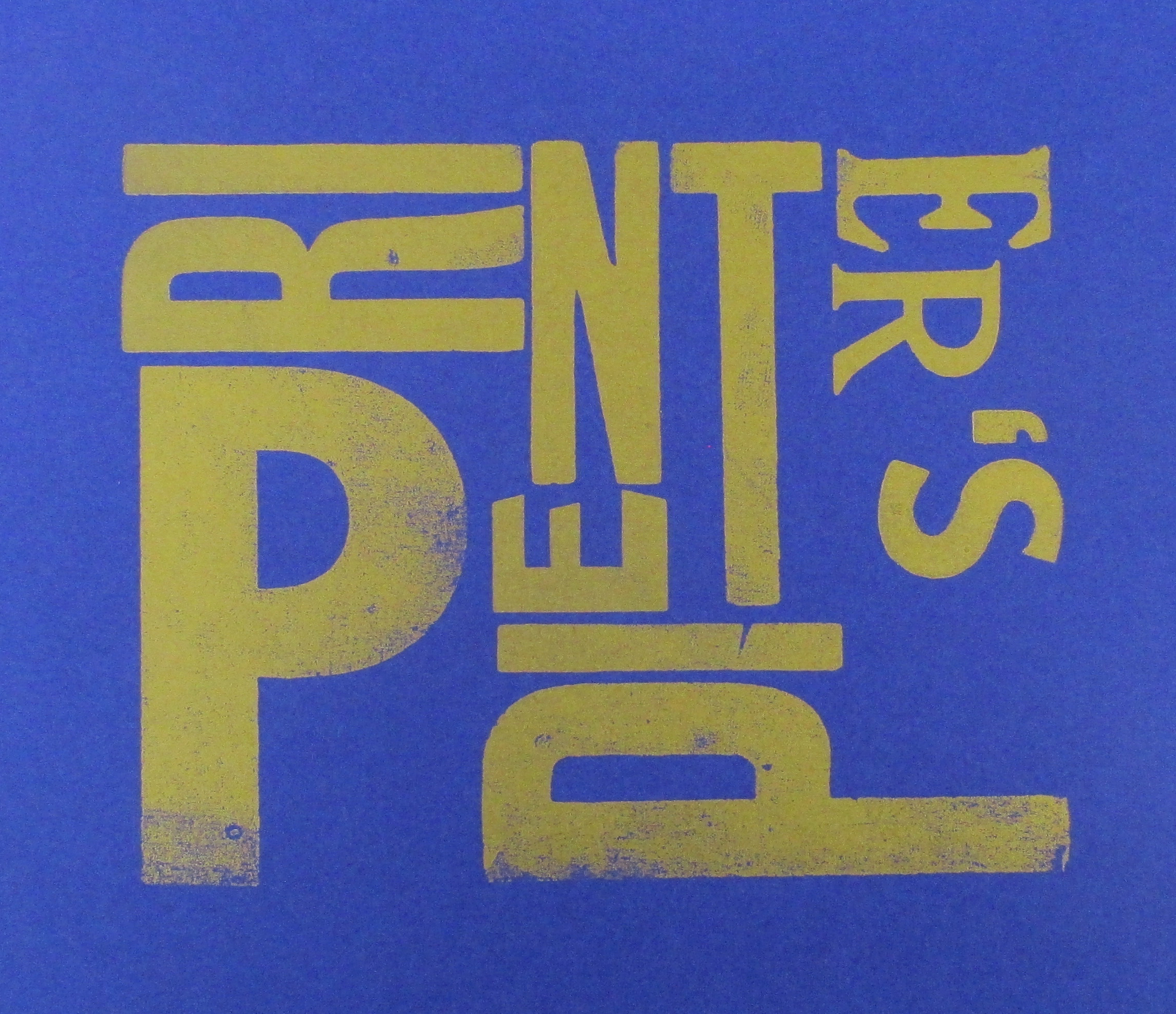
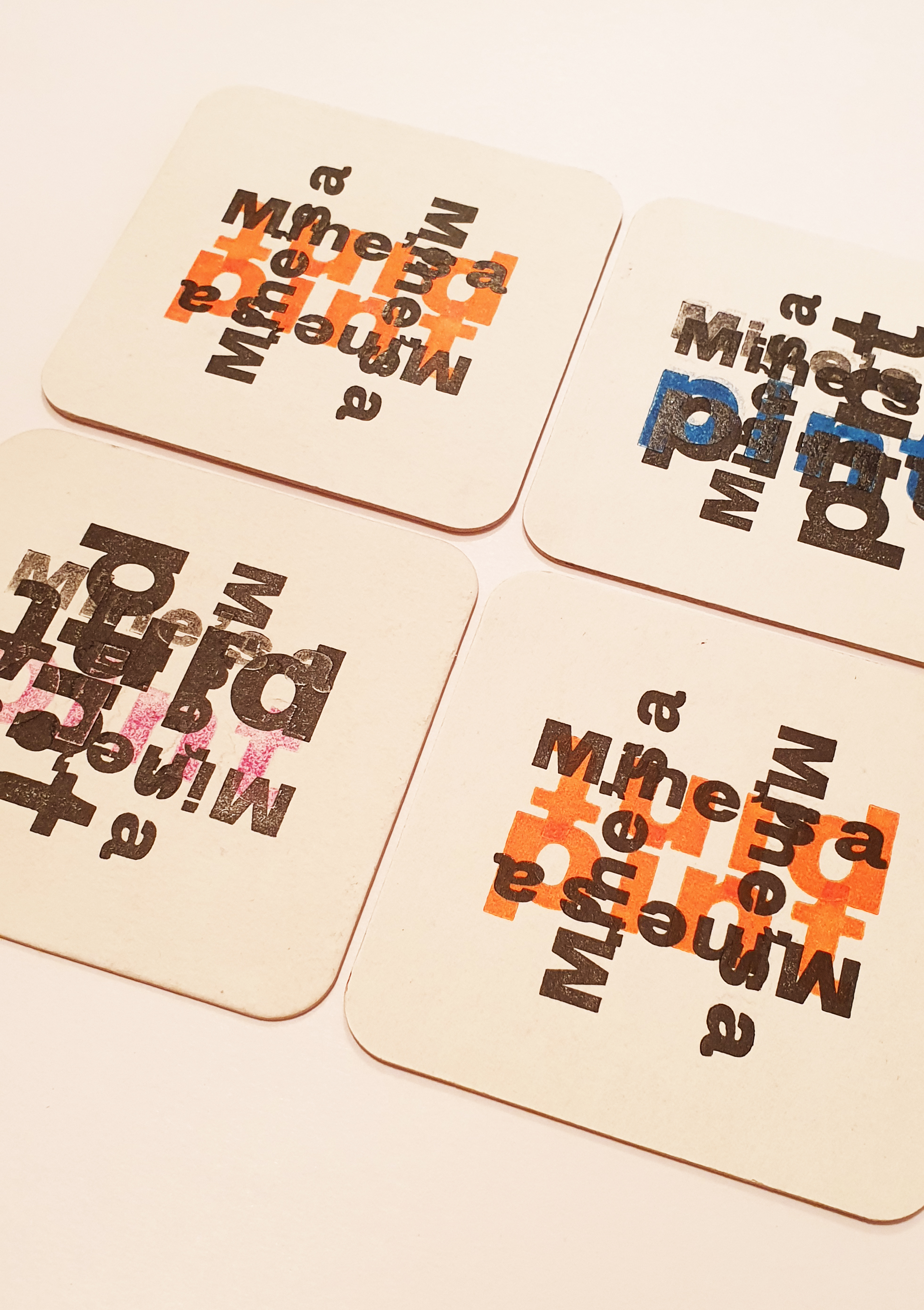
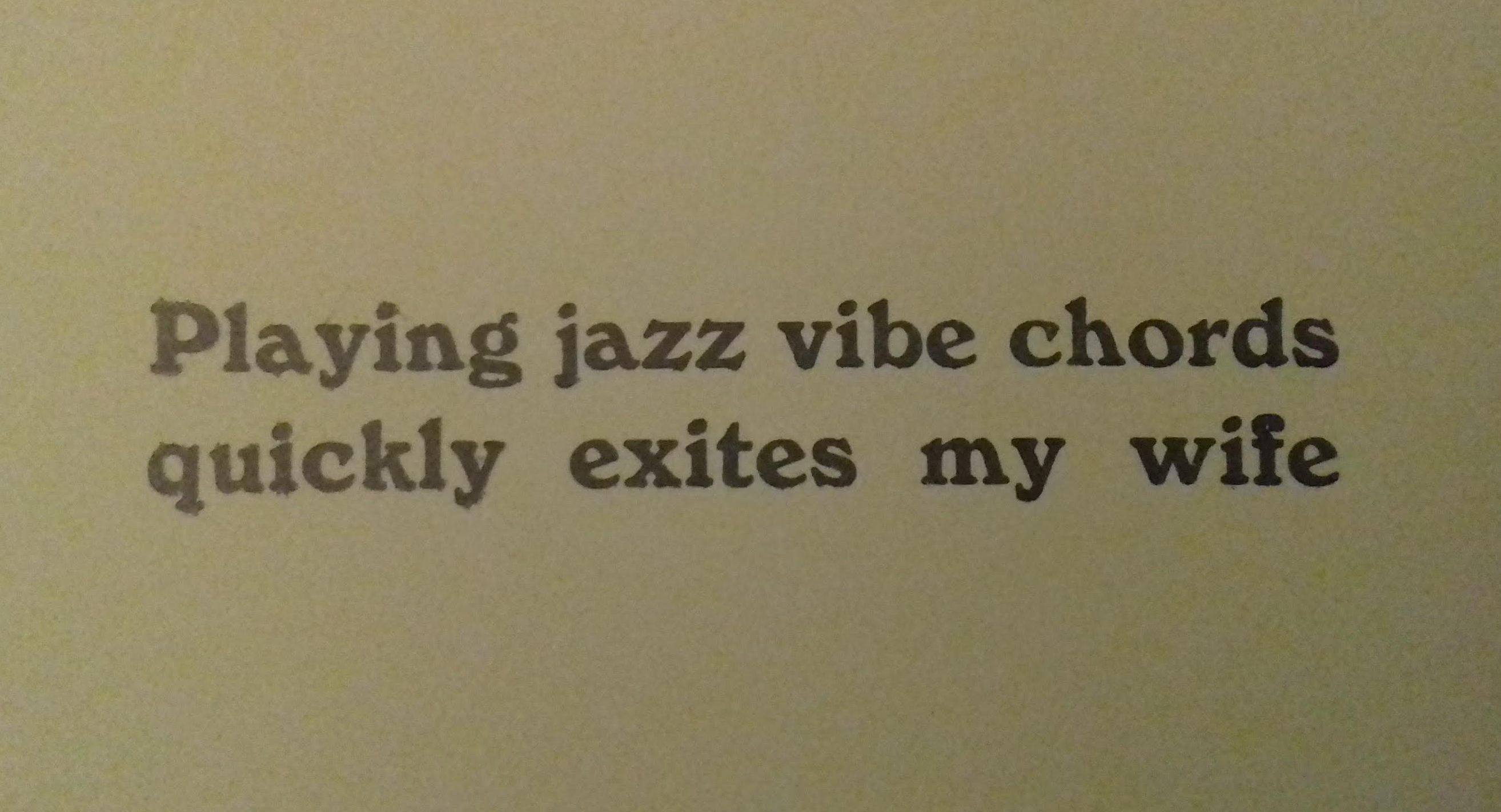
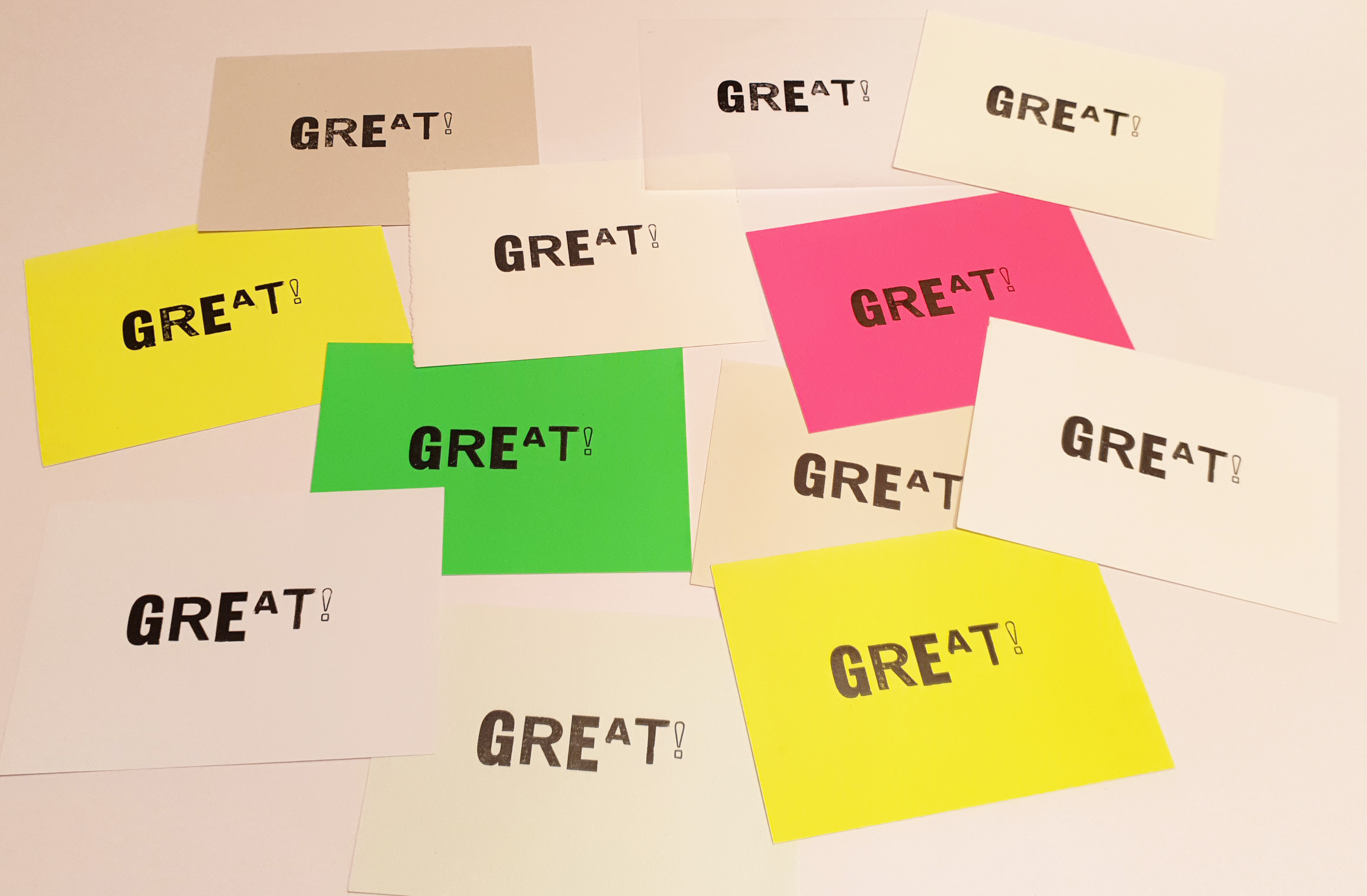
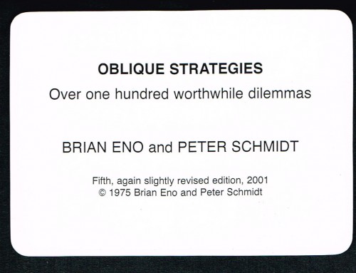
The allure of letterpress printing won’t diminish and I’ll be rolling up my sleeves and inking up my rollers again soon. But in the meantime, here a few examples of work I produced there to peruse.
Not quite hot off the presses, but hopefully still exuding a nice bit of warmth.



Leave A Comment